
Logo (Ideas): Bobup & Nanuda Kitchen & 2-Hour Eatery (Kitchen-sharing Startup)
I had an opportunity to work with a kitchen-sharing startup few years ago.
They did not have a name yet, so I suggested a few names that could fit their business, along with matching logos.
Here are some of them (the rest are politically sensitive).
The first one is called Bobup because the business operated on the idea of pop-up restaurants. Bob means rice in Korean, so it was a pretty damn nice pun. I think I came up with this name. Maybe not. idk.

It's got a picture of rice in a rice bowl with a roof over it. The roof also means an upward arrow because I wanted tHE BUSINESS TO MOVE UP GETIT?
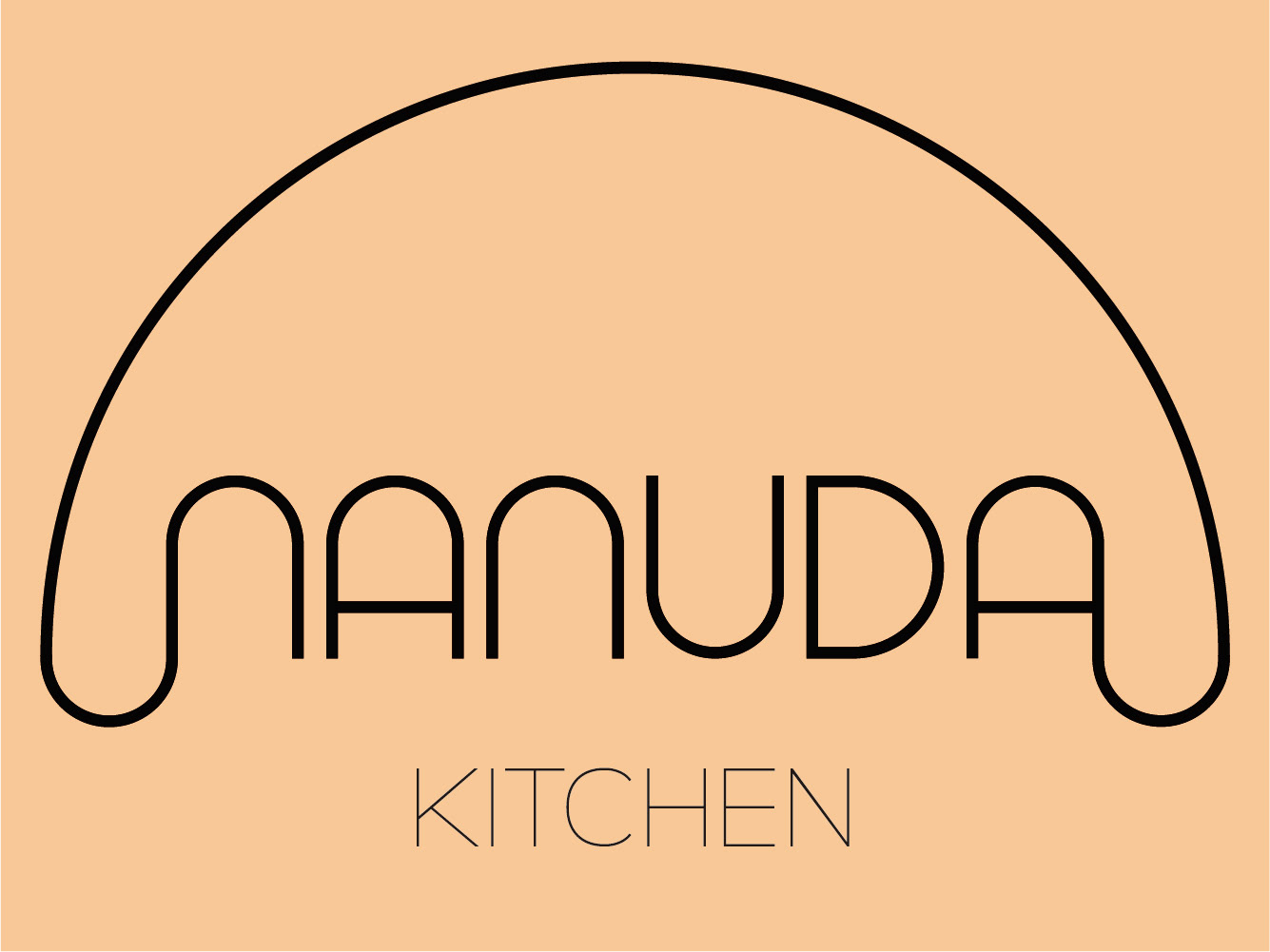
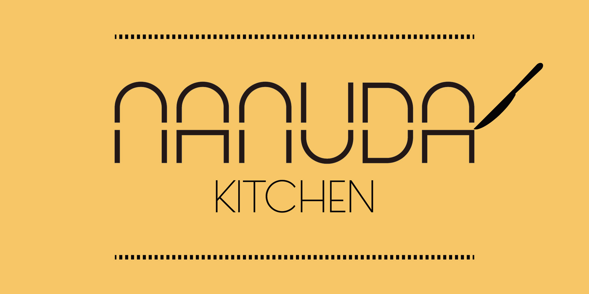
Nanuda Kitchen means To-Share Kitchen. The CEO came up with this name and he wanted an image that could show something warm...like how the art of sharing is warm...like hugging...so I made the one right above. Below was my initial understanding of Nanuda because it also means TO DIVIDE. I mean sharing a kitchen for its closed hours is technically dividing a business.
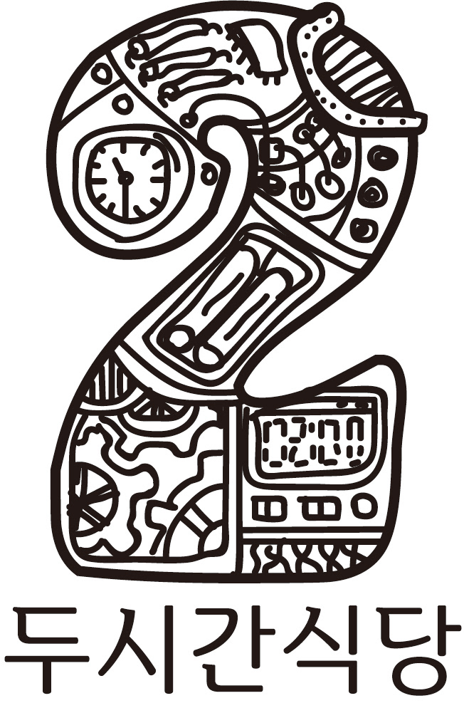
There was another candidate for the company's name, which was Two-Hour Restaurant.
I doodled this and suggested this since I made this style of logo for a microbrewpub and that's where he got my contact to get me to design stuff. It was a rough sketch but I kinda dig how dirty it looks.
None of these got picked and I don't know how the business ended up, but he was a very nice man and I wish I could keep working with him.